Campaigns and visual inspiration on social media in 2026: who's setting the pace

The campaigns people remember most in 2026 are rarely one spectacular post — they're visual systems repeated with variations: same framing, same rhythm, same type of story told in episodes. You don't need a big-brand budget to copy the logic; you need consistency and a clear idea of what someone following you should recognise by the third encounter with your content.
Serialise instead of bursting
A clear trend across consumer, education and service brands is treating the feed as a series, not a showcase of loose pieces. Product launches in three acts — teaser, reveal, detail — tutorials in five instalments, "customer week" with a different case each day. The hook isn't only in the first image, but in the implicit promise of continuity.
Visually, that means recognisable templates: same frame, visible numbering ("01/05"), fixed background colour per season, identical typography each episode. Someone seeing the third understands there's a first and second to find — and that extends time on the profile.
Behind the scenes as main content
What used to be Stories "extra" now fills the feed on purpose. Workshops showing packaging, restaurants at prep hour, design studios with sketches on the table — images with less retouching and more human context. They work because they contrast with the rest of the polished feed and build trust without long copy.
The visual key is framing like the rest of the brand — same palette, same discreet logo, same ratio — so it doesn't look like improvised content from another profile, but a deliberate facet of the same identity.

Collaborations with a shared visual frame
When two brands or a creator and a company collaborate, what works best isn't mixing two distinct styles in one confusing piece, but agreeing a common frame: split screen, half in each brand's colour, one brand's product in the other's hand with neutral overlay. The audience understands the alliance in a second because the structure is familiar — not because they read an explanatory paragraph.
- Define the ratio first (4:5 usually fits both parties' feeds).
- Reserve space for each brand's @ or logo without covering the product.
- Prepare story and feed versions from the same master frame.

UGC with clear visual rules
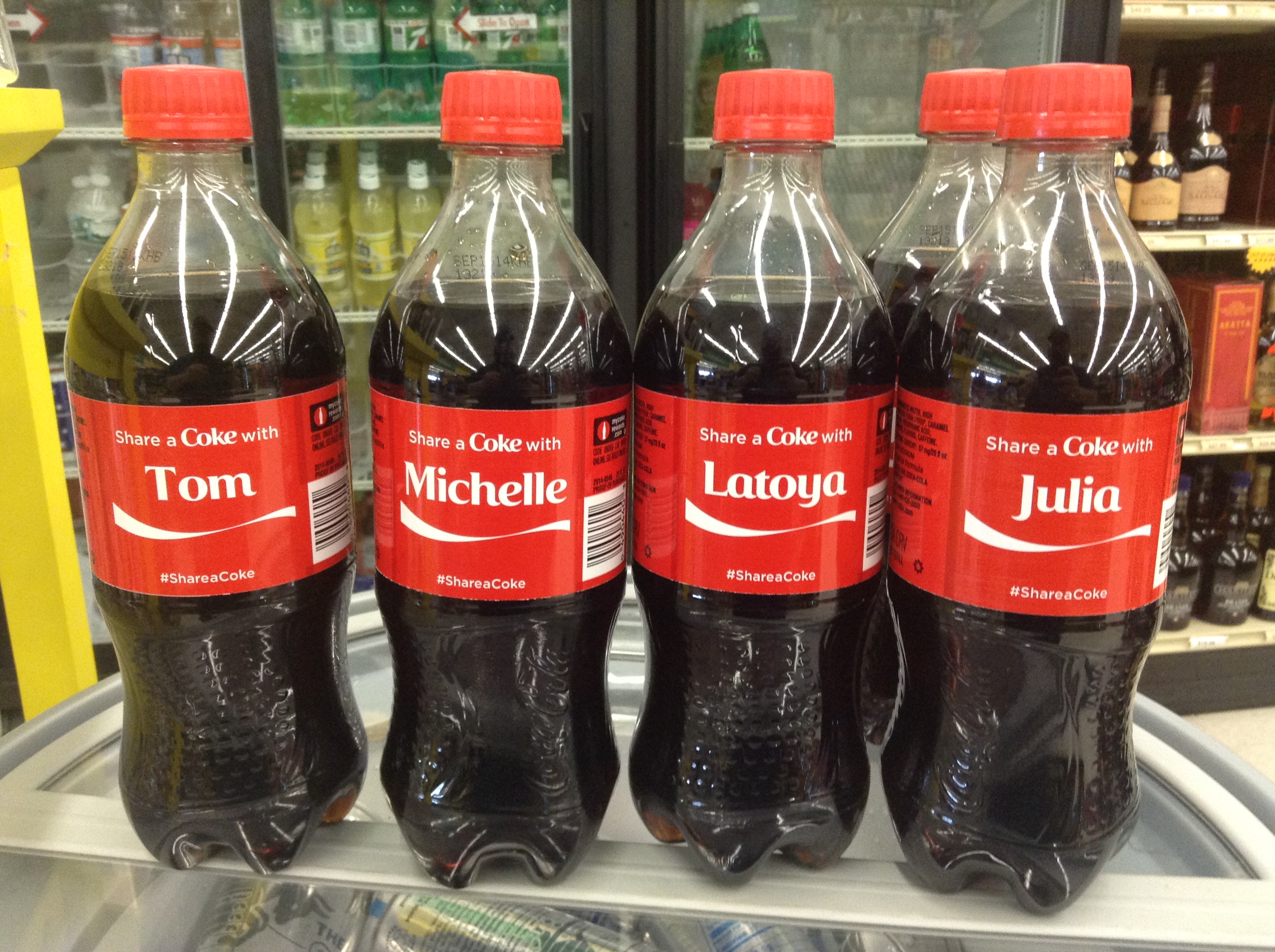
Campaigns asking for user-generated content work when they give a frame, not just a hashtag. "Photo with product in left hand, window light, blurred background" produces a coherent wall; "show us your style" produces pretty but unrecognisable chaos as a campaign.
Medium and small brands apply this with downloadable templates, own filters or an overlay colour participants add before posting. The result on the brand feed looks curated without a studio shoot with every customer.
Product in layers: detail, context, use
Another recurring structure in product campaigns — from cosmetics to tools — is the visual triad: macro of detail, photo in use context, and "hero" shot for carousel or cover. Three images telling the same story at different focal distances, published together or spread across the week.
For service sellers, the equivalent is result / process / team — three shots anchoring the same promise from different angles.

Creators setting pace without big productions
Among independent creators, what stands out in 2026 is format regularity more than one-off spectacle. An educator with the same green background and yellow subtitles every Reel; a photographer with "one frame a day" series in 4:5; a personal brand with carousels that always start with a question in large type. The audience doesn't remember each piece — they remember the pattern.
That pattern is replicable: it doesn't require expensive gear, it requires deciding what not to change between posts.

What small brands can steal
- Visual season: one month with a different accent colour, not a full rebrand.
- Carousel cover as poster: one phrase, readable in thumbnail, coherent with the last slide.
- Reuse the same set: one wall, one table, one window — change the product, not the scene.
- Repeated visual CTA: arrow, drawn button or colour corner that always leads to the same destination.
- Adapt, don't redo: the campaign lives in story, reel and feed from the same base frame.
One-week micro-campaigns (no big team)
You don't need a three-month editorial calendar to apply these ideas. A five-day micro-campaign — same background, same format, a different message each day — already trains the algorithm and audience to recognise your rhythm. A restaurant can show a different dish each night with the same table and light; an online shop, one product a day with the same hand-and-product frame.
The advantage of thinking in series is that the second piece costs less than the first: the scene is solved, the palette chosen, only the protagonist changes. That's what separates an account that "occasionally posts something pretty" from one that looks art-directed even with one person behind it.
Checklist before launching a campaign
Before publishing the first piece, it's worth resolving these questions — not to block creativity, but so the series doesn't break by the third instalment:
- What's the master ratio (9:16, 4:5, 1:1) to derive the rest from?
- What element repeats in each piece (colour, typography, framing, numbering)?
- Are story and thumbnail versions ready if the campaign includes video?
- Does text read on a small screen with the app interface on top?
If you already have the main piece of a campaign and need versions for each network, adapt it here keeping the frame you defined.